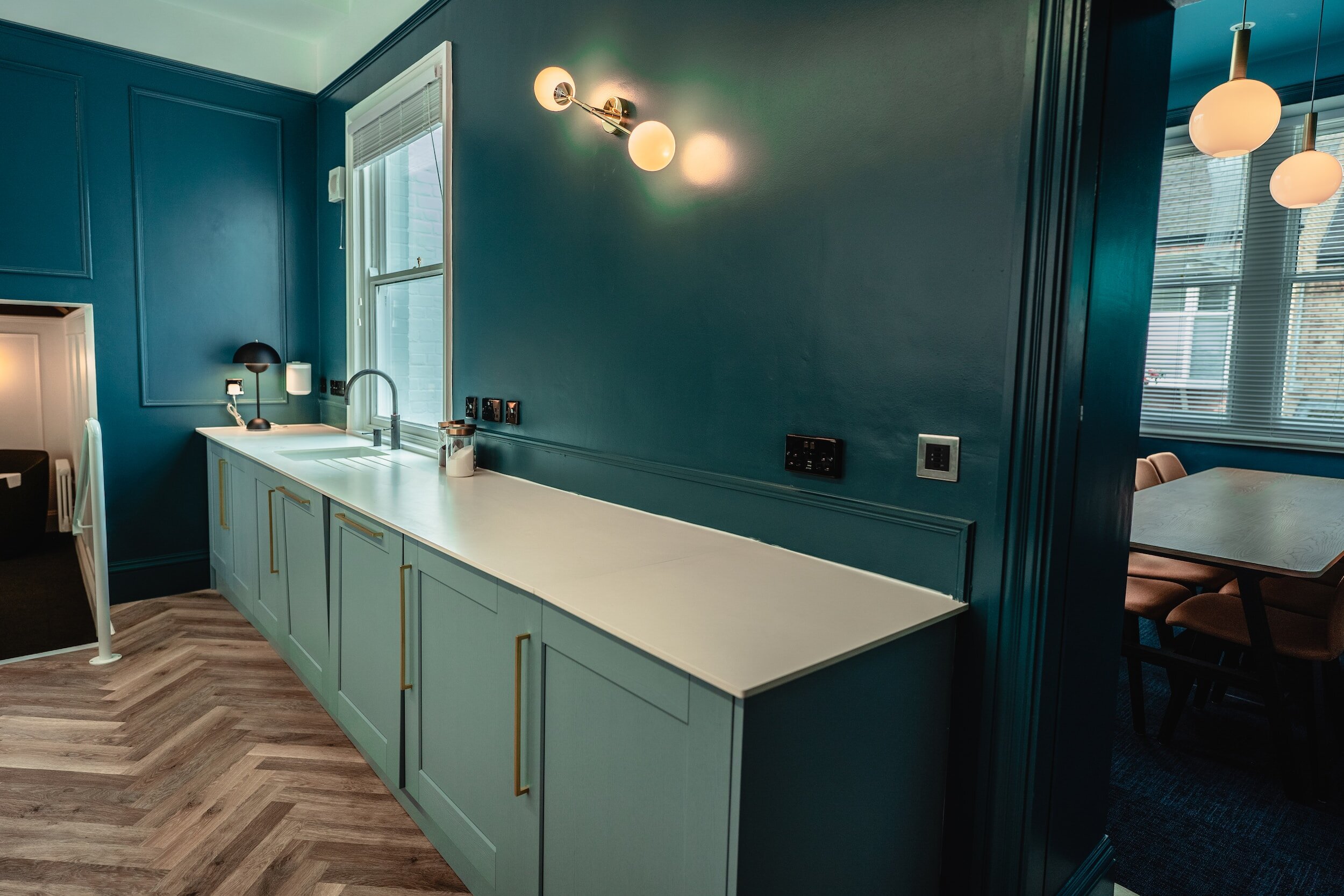
BLUE TAKES CENTER STAGE AS THE MOST TRENDSETTING COLOR OF 2024
In addition to deciding the fun names of colors and palettes, paint manufacturers also take the time to highlight particular shades that will influence design in the year to come, usually dubbing them their color of the year.
While occasionally they align on color choices, the process often leads to diverse selections because of differing research methodologies and regional influences. However, for 2024, shades of blue are trending, with various color companies selecting the hue for its calming and regenerative qualities.
“Colors inspired by nature have been everywhere since 2020,” says Sue Wadden, director of color marketing at Sherwin-Williams. “In the first half of the decade, greens and earthy tones took over the home design space, and now we’re seeing a shift into ethereal tones and blues that still fall into the nature-inspired trend, which is why we chose to highlight a blue color.”
Courtesy Sherwin-Williams
Sherwin-Williams selected Upward, a light and airy blue with a little bit of gray, as its 2024 Color of the Year.
“We chose this lighter breezy shade because it’s a peaceful color that evokes happiness and positivity and creates the perfect calm environment that homeowners seek in their homes,” adds Wadden. “We’ve seen a shift in the home leaning into whites and lighter tones, and we believe coastal chic is going to replace the popular farmhouse trend, and a light blue like Upward is the ideal color to achieve this new look.”
Courtesy Dunn-Edwards Corp.
Moving slightly darker, but continuing with the calming and peaceful qualities, Dunn-Edwards named Skipping Stones, a serene and steely blue with hints of green and gray, as its Color of the Year for next year.
“For 2024, calming blue is bubbling up—with Skipping Stones set to encourage moments of reflection and optimism in both residential and commercial design,” says DeMing Carpenter, color expert at Dunn-Edwards. “It’s part of the resurgence of blue and represents a shift away from the bold, warm-toned colors we’ve seen gain popularity over the past few years.”
Courtesy Benjamin Moore
Taking inspiration from the sky and space, Benjamin Moore also chose a blue Color of the Year: Blue Nova. The intriguing blend of blue and violet “is an alluring mid-tone that balances depth and intrigue with classic appeal and reassurance,” says Andrea Magno, color marketing and development director at Benjamin Moore.
Hannah Yeo, color marketing and development manager at Benjamin Moore, adds “Blue Nova continues the move started in 2023 to use eye-catching color in the home, while expressing personality and a willingness to explore color.”
Courtesy Valspar
Valspar split the middle of the two main nature-inspired hues and announced Renew Blue, a balanced blue with a touch of grayed sea green, as its 2024 Color of the Year.
“Inspired by fleeting elements like fog, mist, clouds, and glacier lakes, Renew Blue elevates the everyday mood, encourages self-expression, and evokes a feeling of balance and calm, with a twist of unique spontaneity,” says Sue Kim, Valspar director of color marketing. “Blue is a classic shade that has become the new neutral for today’s home and can be mixed and matched to fit a variety of design styles and applications.”
C2 Paint, a smaller premium paint company based in New York, continued the trend as well by selecting C2 Thermal, a fluid, refreshing blue, as its 2024 Color of the Year.
Courtesy C2 Paint
“C2 Thermal reminds us of a vast blue sky and the infinite array of blue hues nature offers to help restore and redefine our mood,” says Philippa Radon, interior designer and C2 Paint color specialist. “This bespoke pale yet punchy blue is poised for adventure and brimming with hope, evoking feelings of loyalty, trust, and confidence.”
When asked for the best applications of blue within homes, the color experts recommended the front door for an inviting curb appeal, an accent wall to establish a captivating focal point, kitchen cabinets, bathrooms for a spa-like oasis, and home offices to foster a soothing work environment.
“I recommend starting in spaces where homeowners spend a lot of their time due to the peaceful nature of the color, like a master bedroom,” continues Wadden. “Nurseries are also a great choice.”
As for colors it pairs well with, Yeo says “blue shades are known to pair gracefully with myriad colors: creating a cool color scheme with greens and violets, injecting fun and creative spaces with yellows, transforming the space into a calm and tranquil oasis with neutrals, and bringing balance to complementary oranges. The sky is the limit in terms of application.”
SOURCE: BuilderOnline

